
Monday, 12 August 2013
David Atkins - Artist / Ink Experiments
Specialising in Painting and Printing, David, a UK artis from Dorset has exhibited all over the country. Inspired by his immediate surroundings and travelling he has produced many works of street, city and landscapes.
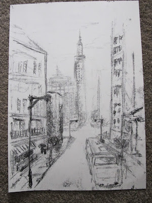
After seeing how he used ink and paint, I decided to try and have a go at working in this kind of style. Its a very different style, and maybe a little 'off task' but thought it might get me to avoid blending so much and focus on shapes and dark and light tones.
Using printing Ink, A3 paper, a pencil and a large desk, I firstly tried a quick sketch, allowing myself only 10 minutes. My thought behind this was to try to get a busy, erratic look to the piece. By giving myself a time limit I thought that I would work more instinctively and quickly.
I think that maybe spending 15-20mins would have been better as I think the piece is missing some detail an is a bit bland in certain areas.


 Above and right, I spent longer on this piece and tried to include more into the foreground objects and a more faded distant look to the background. This was my more successful attempts.
Above right you can see the marks that I made on the reverse of the page to press the ink onto the paper. It was mainly a collection of long and short lines in a variety of directions and frequencies. I think that I made a good attempt at tone with this technique.
Right, a zoomed in snap of the pencil marks made on the above image.
Drawn from some photo's that I took in france, I wanted to do my own version in the DA style. Quite an ambitious task on reflection trying to add a little too much into it. I think if i'd stripped in back and just focused on the main objects more. Although I did leave out and change the scene a fair bit.
I find these very interesting to look at, and wonder in the same or similar feel/ look could be achieved using other media??
![]()
After seeing how he used ink and paint, I decided to try and have a go at working in this kind of style. Its a very different style, and maybe a little 'off task' but thought it might get me to avoid blending so much and focus on shapes and dark and light tones.
Using printing Ink, A3 paper, a pencil and a large desk, I firstly tried a quick sketch, allowing myself only 10 minutes. My thought behind this was to try to get a busy, erratic look to the piece. By giving myself a time limit I thought that I would work more instinctively and quickly.
I think that maybe spending 15-20mins would have been better as I think the piece is missing some detail an is a bit bland in certain areas.
 |
| David Atkins - 42nd St. NYC |


Above right you can see the marks that I made on the reverse of the page to press the ink onto the paper. It was mainly a collection of long and short lines in a variety of directions and frequencies. I think that I made a good attempt at tone with this technique.
Right, a zoomed in snap of the pencil marks made on the above image.
 |
| Parisien landscape in Ink |
Drawn from some photo's that I took in france, I wanted to do my own version in the DA style. Quite an ambitious task on reflection trying to add a little too much into it. I think if i'd stripped in back and just focused on the main objects more. Although I did leave out and change the scene a fair bit.
I was fairly happy with most of the achieved tones, although more highlight required I think.
David uses very confident lines, broad/ vague details with patches of very fine intricate bits. A good blend on simple and complex art well balanced that works well.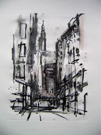 |
| David Atkins - NYC Morning Monoprnt |
I find these very interesting to look at, and wonder in the same or similar feel/ look could be achieved using other media??
Assignment One
 |
| A selection of drawings and experiments for the final piece. I did them on a variety of different sized paper so wanted to put them all together on an A2 piece. |
I found this assignment ok, and it was a good first one to get me back into drawing a large scale main piece. I do however feel as if I may have gone at it like a bull in a china shop, and with a little too much enthusiasm. I fear I may have spent a little too long on them, instead of producing a more basic image focusing on the previous project work.
Should I have used the hatching technique on one or both of the pieces, or did it not matter??
Should there be more prep work?
I was happy with my objects that I chose and the composition that I ended up with as I thought that i'd managed to get a reasonable amount of depth to each drawing and a fairly interesting spread of items.
I purposely tried to choose circular objects as i find those most difficult at times, really to see what I could do with the many lines on the camera lenses. Likewise with the other main piece, I used a lot of watercolour as a base layer, then added in some pencil crayon and chalk to add some extra detail.
As part of the prep work I started off looking at stationary, and even experimented with a mono printing techniques and some charcoal. I wanted to try and use some different media to see what I wanted to use as well as settle on which objects I would draw.
Natural
Having in the past been more that a little paint shy I again wanted to try something more with watercolours. I used some watercolour primarily as in a previous drawing in my sketchbook I was more than a little surprised at a job well done, I thought. The larger piece I thought turned out well. I put in some varied textures and colours, set about trying to observe the lighting as in previous projects. I had started to use watercolour on the apple shadows, but found it a little too much, particularly as i'd only used cartridge paper and not the thicker watercolour paper, so I switched to pencil crayon.
I felt that I could have spent more time perfecting this again, but decided on calling It a day before I overworked it. As a target for myself I will try not to spend quite so long and try to use faster techniques. I like realism too much I think.
If I did the Assignment again I would still go for similar object choices as I was happy with those. I would maybe have trying to have used the hatching techniques in them. I guess if i'm honest I avoided the hatching as I'm not really a fan of large scale images that have had the shade and tone added in this way.
 |
| Watercolour I tried to a variety of objects for my main piece, including these pine cones. I found them quite tricky and was not over the moon with the results so decided not to use them in my main piece. I need to apply more contrast and variety of highlights and shadows for me. Something to re-visit later. |
 |
| Charcoal Sketches using some hatching and blended tone. I tried to shoe more tone in this image. |

A few sketches and some attempts at fine tuning my use of watercolour and pencil crayon. I was also still not set at this stage on what I was including in my final piece.


 |
| Natural material made books in Pastel |
 |
| MAIN PIECE - NATURAL OBJECTS |
Man Made Objects
 Experiments with printing ink. I put a layer of ink on the table, then drew the objects on a piece of paper that was placed over the ink. The result is then a little bit of a surprise as you don't see the result until you lift the paper from the ink.
 |
| Another version of the Ink image drawn in pencil and colour added using watercolour and crayon. |
 |
| Strict watercolour only piece to see what happened. A little wonky but overall very encouraging. |
 |
| Charcoal on Yellow paper for a different look. |
I looked at a variety of materials to use and a few different compositions, but decided to settle on something I was more comfortable with for a first Assignment.
MAIN PIECE
I decided I had spend long enough on it an decided to stop and change nothing else, then I noticed the strap to the left which I then wasn't happy with. I felt that the line and perspective was a little off.
I also wanted the drawing to have a smoother look to it, but due to the materials used and the paper grain, it was a little rough for my taste in the end.
 |
| MAIN PIECE - MAN MADE Pencil & Pencil Crayon Only |
The objects challenged me as I wanted, so in that respect I got what I wanted from the piece. Happy overall, but wouldn't put it in a gallery!!
Check & Log
- I think that this way of enlarging drawing is an accurate way of doing it, although you can loose a bit of that fluency sometimes in the strokes that you make if you are trying to get an identical drawing.
- I'm happy with my replica drawing and think that in someways its a little better as it was the second time of drawing it. I also had the chance to slightly change a error in the ellipse in the glass. (Although maybe I shouldn't have.)
![]()
- I'm happy with my replica drawing and think that in someways its a little better as it was the second time of drawing it. I also had the chance to slightly change a error in the ellipse in the glass. (Although maybe I shouldn't have.)


Friday, 26 July 2013
Check & Log
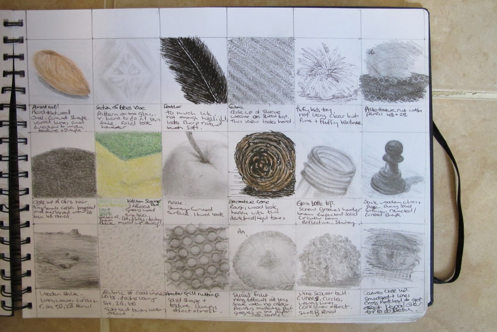
- I have discovered that by mixing certain materials together can produce some great results. A careful use of water and a mixture of a variety of brushes. I discovered that old, dry, short brushes with spread and uneven bristles is good to use to re-create wood textures and rough looking textures. Along with this a careful use of cloths and scrap paper to regular water and colour strength I have found to be an effective technique.
I have tried Inks, with feathers, random bits of wood, as well as with brushes. I have ordered a specific pen for use with dipping ink to try and further experiment with this method.

 - I am getting better with hatching. Small items I feel fairly confident with but do struggle with larger scale hatching. I have experimented with a range of different materials and have found the most success using fine line and biro pens for this technique. I find that I can control the form more accurately and describe the curves ok with these, see the pear and mug on the right.
Items such as charcoal that are very brittle I didn't find very successful at all. These are much better suited to blending and larger format pieces.
FROTTAGE: I'm has its place, but personally I have to admit to switching off almost instantly. You can get some really good effects and textures that i'm sure would be suited to more abstract work. I this way of working I not really my thing I can't see me using this method very much. I won't rule it out, but it didn't really do it for me as at present I find it quite limited. I may yet prove myself wrong in this! (We shall see) Below is one of my more successful attempts.

![]()
I have tried Inks, with feathers, random bits of wood, as well as with brushes. I have ordered a specific pen for use with dipping ink to try and further experiment with this method.


Items such as charcoal that are very brittle I didn't find very successful at all. These are much better suited to blending and larger format pieces.
FROTTAGE: I'm has its place, but personally I have to admit to switching off almost instantly. You can get some really good effects and textures that i'm sure would be suited to more abstract work. I this way of working I not really my thing I can't see me using this method very much. I won't rule it out, but it didn't really do it for me as at present I find it quite limited. I may yet prove myself wrong in this! (We shall see) Below is one of my more successful attempts.

A drawing with textures

Water colour, Pencil, Pencil crayon
Initially I was very pleased with this drawing. I feel that I have managed to demonstrate a number of textures within the piece but for me again I need to be more confident with shadows to really make the objects stand out.
Trying to catch up with this blog to where I am in the course has really given me a valuable re-review of what I have done. This piece however was one of my first efforts at using watercolour and pencil crayon in the same piece. Previously it was something I had stayed away from, but I have really discovered that I like working in this way.


Tuesday, 23 July 2013
Check & Log
- I don't if i'm honest have any preference to man-made or natural object being easier to suggest three dimensions. Saying this, I do find it becomes more difficult a task overall when the object it packed with a lot of texture detail like dents/ holes etc as well as shadows. What I will say I back to a previous point I noted was that the three dimensions are far easier to suggest when lit more appropriately. These point would be my made pointers at this stage:
1). Strong light source to provide more a interesting look and character to each object
2). A little depth to the composition. This can be helps using a few objects positioned strategically and even suggest what the object is on.
3). Confident shadow and highlights!
4). Accurate perspective. A the very least try to have parallel lines and other relevant lines that share a relationship to be going in the correct general direction.
- My fruit drawing was fairly well drawn I thought, with a good composition providing depth. I just lacked a more interesting use of light and background detail to be a successful finished drawing.
- I deliberately tried to suggest movement in my drawing so that the picture takes you towards the back and then around and back to the apple. I pointed the curved banana, leaf, the flower stem purposely backwards into to background. The vibrant red apple was then placed in the middle and the flower stem across the arrangement, but still pointing into the frame, to try to create a little tension. I did play about with the layout and was happy with my final choices in that respect.
- I then wanted to draw from the front of the arrangement at an angle that I would have taken a photo of the objects. I put them on the floor in my living room and sat on the floor directly in front and slightly to the right.

![]()
1). Strong light source to provide more a interesting look and character to each object
2). A little depth to the composition. This can be helps using a few objects positioned strategically and even suggest what the object is on.
3). Confident shadow and highlights!
4). Accurate perspective. A the very least try to have parallel lines and other relevant lines that share a relationship to be going in the correct general direction.
- My fruit drawing was fairly well drawn I thought, with a good composition providing depth. I just lacked a more interesting use of light and background detail to be a successful finished drawing.
- I deliberately tried to suggest movement in my drawing so that the picture takes you towards the back and then around and back to the apple. I pointed the curved banana, leaf, the flower stem purposely backwards into to background. The vibrant red apple was then placed in the middle and the flower stem across the arrangement, but still pointing into the frame, to try to create a little tension. I did play about with the layout and was happy with my final choices in that respect.
- I then wanted to draw from the front of the arrangement at an angle that I would have taken a photo of the objects. I put them on the floor in my living room and sat on the floor directly in front and slightly to the right.

Composition of natural objects

Very happy with the shapes and depth to this composition. I especially pleased with how the daffodil turned out as I nearly threw my sketchbook out of the window. A little perseverance and it paid off! Well... it looks like a daffodil!
Again, looking back at it now as I started a blog after assignment one and am trying to back track, more darker tones and more confident highlights on each object.Light source here was from above but it wasn't really a strong source, just the living room lights so the object were more evenly lit. Result of that was a lack of interesting shadow/ light detail.
I have since made a mental note... USE A STRONGER LIGHT SOURCE FOR ADDED INTEREST AND TO MADE IT EASIER FOR MYSELF!!

Saturday, 20 July 2013
Check & Log
When looking at cast shadow and reflected light I've found that I need to be a lot more confident. Remembering to take a step back and look from afar to see the effects when adding in highlights and shadows.
After talking with a few fellow artists i've discovered that I have a slight issue with mid-tones!! I never really thought much of using a putty rubber so tried to avoid it whenever I could. Over the past few weeks however I can say that I am converted!! I used to start by adding in shadows, mid-tones and then try to leave the highlights. I've found it much quicker and even more effective to start with mid-tones, add in dark tones, then rub in the highlighted area's.
This technique is much better for getting in reflected light. I find It best to put in the cast shadows first and then work in the highlight's. As least at this stage these are my initial thoughts. I'm sure with more practise and experience I my develop this or a different approach.

In the drawing that I have tried to show reflected shadows I noticed that the reflections tend to bend away from the object in the reflection. That is if like the shiny coffee jug (Right) gets smaller towards the top. I deliberately wanted an object this reflective to really try to distinguish the reflections. I fear though now looking back I may have lost some cast shadows.
I certainly could have added more dark tones and been more confident with the blacks.
![]()
After talking with a few fellow artists i've discovered that I have a slight issue with mid-tones!! I never really thought much of using a putty rubber so tried to avoid it whenever I could. Over the past few weeks however I can say that I am converted!! I used to start by adding in shadows, mid-tones and then try to leave the highlights. I've found it much quicker and even more effective to start with mid-tones, add in dark tones, then rub in the highlighted area's.
This technique is much better for getting in reflected light. I find It best to put in the cast shadows first and then work in the highlight's. As least at this stage these are my initial thoughts. I'm sure with more practise and experience I my develop this or a different approach.

In the drawing that I have tried to show reflected shadows I noticed that the reflections tend to bend away from the object in the reflection. That is if like the shiny coffee jug (Right) gets smaller towards the top. I deliberately wanted an object this reflective to really try to distinguish the reflections. I fear though now looking back I may have lost some cast shadows.
I certainly could have added more dark tones and been more confident with the blacks.
Friday, 19 July 2013
Research Point - Paul Caulfield
Paul Caulfield (1936-2005) - London born Painter and Printmaker associated with Pop Art.
 |
| Paul Cauldfield 'White Ware' Prints |
His style was very abstract with lots of flat colour and reminds me of a cross between Roy Lichtenstein and Michael Craig Martin. Although there are many similarities it is the 'White Ware' prints that stand out as being different from the artists I just mentioned.
When I look at these pieces they in my opinion have a very lonely and peaceful feel to them. It is as if he literally cut out the objects from the canvas leaving behind a void of empty space.
Some of the white parts also represent actual light and not just the missing objects. The splashes of colour just add a little more interest which for me takes these ones to another level and make for a better piece of wall art.
The careful positioning of key parts of each composition and the perspective create subtle tension and even some depth.
I sketched a few drawings that were inspired by his style, each different from the other. I have to say I really enjoyed working in this way. I found it genuinely interesting and relaxing. Usually I like to work with music on, yet for these pieces I found myself happily in silence.

I started with the top left drawing in pencil, then switched to a fine line pen to create a more rigid line.
I had just had a cup of coffee and had left it on a case which was on the sofa. This I found a good starting point for a ready made scene. I used a 4B pencil to cross hatch in the tones and then decided to rub them in with my finger. Rather that sit thinking about it I just wanted to quickly go for it and see want happened.
Next I had a go with the lamp drawing. I started in the same way but this time I wanted to try a splash of colour. For this I used some water colours to try to achieve flatter more even colours. I made a few errors with a few of the lines but learnt a lot. If I do this again I will try to simplify it even more that I did.
My next drawing was in fine line and was another attempt at the negative drawing task for earlier in this course. For this I added some cross hatching to add some tone. Just realised I missed the shadow from the spoon on the bowl!!


These other works or art by PC again show clearly how his accurate and bold use of line to really make objects stand out. The vacant space left behind adds to each piece and in a way makes it more personal and individual for the viewer as they mentally drawn in what they think should be there.
The below and left image is one I found of PC's, and apart from not having any repeated lines or dots, could almost be one by Roy Lichtenstein. Both artists are not afraid to use space and are very confident with shape and colour.
![]()


These other works or art by PC again show clearly how his accurate and bold use of line to really make objects stand out. The vacant space left behind adds to each piece and in a way makes it more personal and individual for the viewer as they mentally drawn in what they think should be there.
.jpg) |
| Roy Lichtenstein |
 |
| Paul Caulfield |
 |
| Roy Lichtenstein |
Subscribe to:
Comments (Atom)