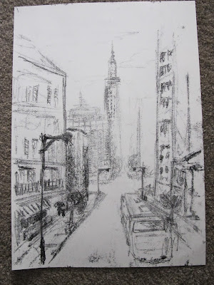
After seeing how he used ink and paint, I decided to try and have a go at working in this kind of style. Its a very different style, and maybe a little 'off task' but thought it might get me to avoid blending so much and focus on shapes and dark and light tones.
Using printing Ink, A3 paper, a pencil and a large desk, I firstly tried a quick sketch, allowing myself only 10 minutes. My thought behind this was to try to get a busy, erratic look to the piece. By giving myself a time limit I thought that I would work more instinctively and quickly.
I think that maybe spending 15-20mins would have been better as I think the piece is missing some detail an is a bit bland in certain areas.

Above and right, I spent longer on this piece and tried to include more into the foreground objects and a more faded distant look to the background. This was my more successful attempts.
Above right you can see the marks that I made on the reverse of the page to press the ink onto the paper. It was mainly a collection of long and short lines in a variety of directions and frequencies. I think that I made a good attempt at tone with this technique.
Right, a zoomed in snap of the pencil marks made on the above image.
 |
| Parisien landscape in Ink |
Drawn from some photo's that I took in france, I wanted to do my own version in the DA style. Quite an ambitious task on reflection trying to add a little too much into it. I think if i'd stripped in back and just focused on the main objects more. Although I did leave out and change the scene a fair bit.
I was fairly happy with most of the achieved tones, although more highlight required I think.
David uses very confident lines, broad/ vague details with patches of very fine intricate bits. A good blend on simple and complex art well balanced that works well. |
| David Atkins - NYC Morning Monoprnt |
I find these very interesting to look at, and wonder in the same or similar feel/ look could be achieved using other media??


No comments:
Post a Comment