Monday, 24 June 2013

Check & Log - Light & Primary Light

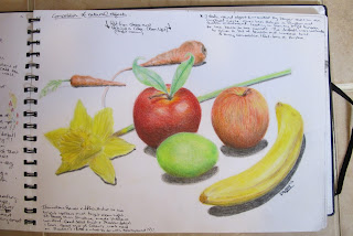
Many of the items that I chose tended to be shiny so distinguishing the light was a little tricky at first as its was something I hadn't done for a long time. I found the slight squint technique worked a treat when picking out the tones I wanted to use. I'm not sure if I prefer to focus on light areas or shadow to start with when adding them to my work. Jury is still out!!

I feel that I need to practice my cross hatching a little more on a larger scale image. Although I did discover that if I persevere and not abandon it too quickly it does tend to work itself out. I started to get a little frustrated to start with when it didn't go quite right.

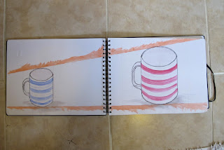
I do feel that i'm becoming more confident drawing basic shapes and stronger outlines. More work needed though on ellipses. The square/ rectangles I feel are ok.


Odilon Redon


 Bertrand-Jean Redon better known as Odilon Redon 
(April 20, 1840 - July 6, 1916) 
Born in Bordeaux, Aquitaine, France. 

Symbolist painter and printmaker
Self Portrait - 1880 (Left)


Odilon has a background that found him flirting with Architecture , Sculpture, etching and lithography. He worked exclusively in charcoal for a period after serving in Franco-Prussian War after moving to Paris. In the 1890s, he began to use pastel and oils, which dominated his works for the rest of his life.

My Opinion
Some of the images of Odilon Redon’s that stood out for me were the ones where that featured a lot of contrast. He used light and dark areas extremely well to ensure that areas of the pictures stood out. The intensity in the 'Boat In The Moonlight' image is spectacular.
His style made sure that when you look at the works that I have picked out, your eyes are drawn directly towards the key main features within. He wasn’t afraid to leave white bright area’s on the canvas/ paper, this is something that I myself need to remember and implement within my own work. I really like the overall style of the works below - the wide range of tones found in both of the images along with his confident use of line.

I am however generally not impressed with how Odilon captured facial features in many of his pieces. With Art being subjective I guess its ok for me to say.  Many of them seem vague or even deformed - dare I suggest unconfident? I can appreciate that if an image is meant to have a more surreal or strange look to it than this is ok. This man is a great artist all the same who I respect. Would I call myself a fan?? For me his work is like Marmite, I either love it or hate it!! 

These 2 pieces I do like because of the mood and expression each has. A relaxed, soft, yet searching or wanting look, like they’re observing something we can’t see. If you look closely at the woman, you could almost imagine her watching someone from across the road while trying to remain inconspicuous.


Images found on http://www.odilon-redon.org 

Odilon Redon Vs Van Gogh

I really like the bright vibrant colours that Redon has used and the soft finish like many other of his works. His use of effective yet subtly intense shadows make for an image you almost want to reach out and touch the pot that is begging to jump off the canvas. It really brings the 3D aspect to life.
Finding this strangely fascinating to look at!!
I wonder though, could he have added more fine detail than he has, or would it then lose its appeal??


For me a more successful still life when compared to the iconic 'Sunflowers' by Van Gogh (below) and technically a better painting. Maybe the fierceness of Redon's colours would make it a more unsettling picture hung on a wall compared to the less somehow in you face yellows from Van Gogh.


Sunday, 23 June 2013

Pre Assignment One Sketch book work


I have currently worked through to Assignment One, and have decided to try and keep an online blog to add and demonstrate some of my thoughts, drawings, and inspiration

Shadows & Reflected Light & Shade


A2 Piece using Charcoal - Not having done this type of work for a while I found is fun to do, but also frustrating getting used to observing the reflections. In the past I struggled with keeping highlight area's intact and separating the light, dark and midtones effectively. I was fairly happy with how this turned out, although I think I maybe need to use a brighter light source or direct the light differently to create more interesting shadows.

I need to use a putty rubber more effectively!!

Reflected Light!!

Some of my work in this area was lost/ damaged when moving house. Not happy, quite liked it!! :(

Tone & Form


Supermarket Shop


Struggled a little with the ellipses on the tin. I fear I may spend too long adding colour when at this stage I should maybe have been focusing on the basic shapes and drawing. Maybe some quick splashes of watercolour or suggestions of colour may speed me up a bit so I can get through more drawing. 

Charcoal Note


Jars & Jugs

Hopefully you can read the notes that I wrote on the page. In future though by using this blog I want to add my notes on here rather that scribble in my artwork as much! 

Boxes and Books


Upload Note

I must point out, although i'm sure its obvious, that this first batch of uploads to assignment one may not be in order of where the projects are in the folder - sorry!!

Observing negative space and perspective

Interesting task! Good for helping to be more confident using lines to create very definite shapes. Due to the permanent nature of this task the shapes are not 100% accurate, however I do like the overall look to the piece, (apart from the dodgy cross hatched area!!)

Charcoal Experimenting

I love to messy, soft, and bold effects of charcoal. Fun to use although better suited to larger format paper. This was A3 and space was filled very quickly.

Drawing 1

I am currently working through some OCA courses and am enjoying getting back into Art.  I am hoping that this course teaches me some new skills and a different way of approaching Art. I'm sure now being older than when I last did an art course it will be much more fun as I know appreciate the arts a lot more. Please feel free to comment on my work constructivley and offer advise if you have any.