Tuesday 18 February 2014

Research Point - Mastery of Drawing

Classic Artist - Leonardo Da Vinci

http://www.drawingsofleonardo.org 

For me when asked to specify a classic artist who is a great example of someone who demonstrates a mastery of drawing, there is no better example than Da Vinci - One of my all time favourites!

Peter Paul Ruben's copy of the lost Battle of Anghiari, c. 1603
Now the expression goes - 'Jack of all trades, master of none' might apply to many, but not Da Vinci!

Architect, inventor, artist, plumber were just a few of his skills. How someone can achieve what he did in one lifetime is beyond me. LDV was simply brilliant, and a true Master!

His compositions, depth to his images, the range of types of artwork from sketches to full on aster pieces are astonishing.


His drawing though was second to none, using a range of materials and mark making techniques to research and develop his studies.

An Artillery Park, c. 1487
LDV's skills of proportion, depth and accuracy are something to aspire to. Hatching a technique seen in many of his drawings is one I would love to get better at. I feel I haven't really given it time enough to create a competent piece so this is something I intend to rectify.

The piece above, Artillery Park demonstrates his accuracy of line and shape in his drawings, as well as some hatching to show some tonal values. The battle scene at the top shows that he was more that capable of taking this further to create a full master piece using subtle colours. He wasn't afraid to really go dark when applying the darker tones and a picture, something I've noticed that I should also do. This tends to make the other tonal values stand out and give the piece as a whole more focus and presence on the page.

I like how he created study pages using different sections of the same subject, sometimes not even completing the whole subject 100%. I guess this shows what he was truing to develop without writing anything. I have to wonder if he actually made any mistakes?


Modern Artist - Paul Cadden

http://www.paulcadden.com


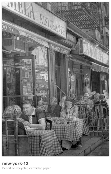
Now this guy can draw!! Artist who can achieve hyper-realistic results like this I take my hat off to.
Where do you start, it looks like a photograph it that good! It begs to question- If Da Vinci had a set of super fine high quality pencils and the same paper as Paul Cadden, how good would his art be then? I guess however the beauty of classic art is that is looks like art. You are never really fooled into thinking its a photo, as back then, they didn't exist. The likeness that artist like LDV achieved don't get me wrong are outstanding, but if I had the choice of a Da Vinci hung on my wall or a Paul Cadden which would I choose? Something to consider!

The seemingly faultless execute of skill in these pictures are amazing, but I guess have a photo to work from would help as I guess some of the great classic artist had to work from quick sketches and memory a lot of the time. So weighing it up, who is better?

Still unsure!

I have to admit to having a great admiration for work like this, the variety of tone achieved and pin point detail and textures. The lack of dark black in the left piece (NVA16) almost gives me the impression of a dusty, scruffy remote area and adds a unique effect that the other 2 don't have.

When asked to look at modern artists, I take that to mean anything from today and back over the past century. Was this right? Who knows but I'm sure a good debate could be had considering
Leonardo Da Vinci VS Paul Cadden.

 Some other pieces to consider!


The variety of marks, techniques involved in producing work to this standard is mind-blowing. So much so that I'm really now sure where to start when breaking it down!!

Tuesday 11 February 2014

Exploring Coloured Media

Experiments with Ink and a brush. I found this quite a lot of fun to do. Having seen work by an artist called Lora Zomie http://lorazombie.com/ where she uses runny media, usually paint or inks to produce very different look to art. A more abstract take from her point of view and a signature 'runny' style and technique. I found that ink was a quick, wet, and very fluid media to use. Goes on the page easy, but is more suited to larger format work for me, unless you use a dippy ink pen. (Which I have ordered to try) 
Ink and salt
I also, after flicking some paint onto the paper decided to splash some salt down onto the paper having seen the effect it had on another artist work. (Dry salt technique) I haven't read up on it yet so just thought i't experiment and see what normal sea salt would do to the ink. I was hoping for a texture to the piece, which I got, and patches where the salt had absorbed the ink/ fluid to leave an almost tie-dyed pattern. This didn't quite work! Don't think the wet/ salt ratio was right! Might try again another time.
Pencil Crayon


Random experiment with lines, dashes, dots, circles and any other random scribble that came to mind. The pattern I started with kind of reminded me of a bird. So implied the shape of one and let it just flow with lots of lines. Inspired by the marks Van Gogh used in his work as this medium was more easy to control due to the small point of the pencil. 
More suited to more detailed smaller pieces and for applying over the top of water colour to tighten up a piece and add more fine detail and definition. 


Doodles, hatching and more of a variety of marks. On from the last piece I tried to use a more controlled approach to this test piece. Haven't really to be honest discovered anything about pencil crayon that I didn't really know here. 
Watercolour base with a bit of crayon over
Pencil crayon


I purposely left this piece part finished to show my experiment and the differences. The nearest ball I put a bit of pencil crayon over to show have even the smallest amount of crayon over the top makes a different. I really like how it tightens up the drawing enabling you to cover a large area with colour firs before then adding more detail to it. The light effects have been brought out by adding some smooth dark tones. Obviously a lot of work still to do for it to be completed.

Oil Pastels
 Have never used Oil Pastels before so didn't really know what to expect. Better for larger pieces from A3 upwards for me. Due to the chunky pastel, fine detail is just not possible. Very good to blend, smudge and manipulate. I get the feeling it would be good for bright vibrant pieces such as fruit or even landscapes.
Very relaxing media.
Chalk Pastels 


Chalk Pastels are very messy if not controlled from the start. Easy to smudge again and can be rubbed out much like charcoal using a good rubber or putty rubber. Easy to blend and get a cloudy, soft effect. Good for landscapes and larger portraits. Detail could be achieves using pastel pencils or even a sharp bit of charcoal.

Something I've used before including the conte chalks. Used to be one of my favourite mediums. I find it very relaxing.

Monday 12 August 2013

light observations in Pastel


David Atkins - Artist / Ink Experiments

Specialising in Painting and Printing, David, a UK artis from Dorset has exhibited all over the country. Inspired by his immediate surroundings  and travelling he has produced many works of street, city and landscapes.

After seeing how he used ink and paint, I decided to try and have a go at working in this kind of style. Its a very different style, and maybe a little 'off task' but thought it might get me to avoid blending so much and focus on shapes  and dark and light tones.

Using printing Ink, A3 paper, a pencil and a large desk, I firstly tried a quick sketch, allowing myself only 10 minutes. My thought behind this was to try to get a busy, erratic look to the piece. By giving myself a time limit I thought that I would work more instinctively and quickly.

I think that maybe spending 15-20mins would have been better as I think the piece is missing some detail an is a bit bland in certain areas.

David Atkins - 42nd St. NYC


 Above and right, I spent longer on this piece and tried to include more into the foreground objects and a more faded distant look to the background. This was my more successful attempts.

Above right you can see the marks that I made on the reverse of the page to press the ink onto the paper. It was mainly a collection of long and short lines in a variety of directions and frequencies. I think that I made a good attempt at tone with this technique.

Right, a zoomed in snap of the pencil marks made on the above image.

Parisien landscape in Ink


Drawn from some photo's that I took in france, I wanted to do my own version in the DA style. Quite an ambitious task on reflection trying to add a little too much into it. I think if i'd stripped in back and just focused on the main objects more. Although I did leave out and change the scene a fair bit. 
I was fairly happy with most of the achieved tones, although more highlight required I think.

David Atkins - NYC Morning Monoprnt

David uses very confident lines, broad/ vague details with patches of very fine intricate bits. A good blend on simple and complex art well balanced that works well.

I find these very interesting to look at, and wonder in the same or similar feel/ look could be achieved using other media??

Assignment One

A selection of drawings and experiments for the final piece. I did them on a variety of different sized paper so wanted to put them all together on an A2 piece. 

I found this assignment ok, and it was a good first one to get me back into drawing a large scale main piece. I do however feel as if I may have gone at it like a bull in a china shop, and with a little too much enthusiasm. I fear I may have spent a little too long on them, instead of producing a more basic image focusing on the previous project work.

Should I have used the hatching technique on one or both of the pieces, or did it not matter?? 
Should there be more prep work? 
I was happy with my objects that I chose and the composition that I ended up with as I thought that i'd managed to get a reasonable amount of depth to each drawing and a fairly interesting spread of items. 

I purposely tried to choose circular objects as i find those most difficult at times, really to see what I could do with the many lines on the camera lenses. Likewise with the other main piece, I used a lot of watercolour as a base layer, then added in some pencil crayon and chalk to add some extra detail. 

As part of the prep work I started off looking at stationary, and even experimented with a mono printing techniques and some charcoal. I wanted to try and use some different media to see what I wanted to use as well as settle on which objects I would draw.


Natural

Having in the past been more that a little paint shy I again wanted to try something more with watercolours. I used some watercolour primarily as in a previous drawing in my sketchbook I was more than a little surprised at a job well done, I thought. The larger piece I thought turned out well. I put in some varied textures and colours, set about trying to observe the lighting as in previous projects. I had started to use watercolour on the apple shadows, but found it a little too much, particularly as i'd only used cartridge paper and not the thicker watercolour paper, so I switched to pencil crayon. 

I felt that I could have spent more time perfecting this again, but decided on calling It a day before I overworked it. As a target for myself I will try not to spend quite so long and try to use faster techniques. I like realism too much I think.

If I did the Assignment again I would still go for similar object choices as I was happy with those. I would maybe have trying to have used the hatching techniques in them. I guess if i'm honest I avoided the hatching as I'm not really a fan of large scale images that have had the shade and tone added in this way. 

Watercolour

I tried to a variety of objects for my main piece, including these pine cones. I found them quite tricky and was not over the moon with the results so decided not to use them in my main piece. I need to apply more contrast and variety of highlights and shadows for me. Something to re-visit later. 


Charcoal

Sketches using some hatching and blended tone. I tried to shoe more tone in this image.


 A few sketches and some attempts at fine tuning my use of watercolour and pencil crayon. I was also still not set at this stage on what I was including in my final piece.


A different angle and approach to the skull. Pencil I felt created a different mood and a completely different look.


Natural material made books in Pastel

MAIN PIECE - NATURAL OBJECTS


Man Made Objects


Experiments with printing ink. I put a layer of ink on the table, then drew the objects on a piece of paper that was placed over the ink. The result is then a little bit of a surprise as you don't see the result until you lift the paper from the ink.  

The same left using ink. I was going to try and add some extra colour over the top, but then decided that this wasn't what I wanted for my second piece so abandoned it.
Another version of the Ink image drawn in pencil and colour added using watercolour and crayon.
Strict watercolour only piece to see what happened. A little wonky but overall very encouraging.

Charcoal on Yellow paper for a different look. 

 I looked at a variety of materials to use and a few different compositions, but decided to settle on something I was more comfortable with for a first Assignment.


MAIN PIECE

I decided I had spend long enough on it an decided to stop and change nothing else, then I noticed the strap to the left which I then wasn't happy with. I felt that the line and perspective was a little off. 
I also wanted the drawing to have a smoother look to it, but due to the materials used and the paper grain, it was a little rough for my taste in the end. 
MAIN PIECE - MAN MADE
Pencil & Pencil Crayon Only
The objects challenged me as I wanted, so in that respect I got what I wanted from the piece. Happy overall, but wouldn't put it in a gallery!! 

Check & Log

- I think that this way of enlarging drawing is an accurate way of doing it, although you can loose a bit of that fluency sometimes in the strokes that you make if you are trying to get an identical drawing.
- I'm happy with my replica drawing and think that in someways its a little better as it was the second time of drawing it. I also had the chance to slightly change a error in the ellipse in the glass. (Although maybe I shouldn't have.)

Enlarging a simple flat image